Delivering a more relevant experience to credit card clients

Context

CSF is a financial services branch from Carrefour Market that provides access through credit card to his clients. CSF is popular between lower income group due to the easy access to credit, however, it offers an experience below the average and leads people to acquire debits. We were requested to value propostion to the Credit Card and redesign the App.

My role

  • UX Research

  • Product Design

research

To define the audience and map the As Is experience we heard more than 100 costumers, employers and stakeholders. We took care to cover local markets and call centers to be sure about the needs and goals of the costumers so we could have a holistic vision of the problems.


One of the clients have more than 15 credit cards!

mindsets

We found out that personas would be a very broad approach to define the audience so we come up with mindsets when we realized that a client can navigate between diferent mindsets due to life happenings.

organized

organized

Multiple payment methods, keep everything on track

Multiple payment methods, keep everything on track.

reckless

reckless

No boundaries, he spends money as there is no tomorrow

No boundaries, he spends money as there is no tomorrow.

prudent

prudent

Afraid of getting in debs, avoid multiple payment methods

Afraid of getting in debs, avoid multiple payment methods.

acrobat

acrobat

Doesnt keep a track of the money, something unexpected can happen

Doesnt keep a track of the money, something unexpected can happen.

the real problem

When we merged the user needs with business reality we could see clearly the real problem here.

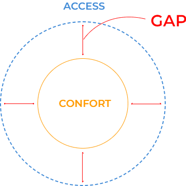
While the Carrefour’s bank offers credit, a mean to have ACCESS to buy everything they need, we found out that our clients need help to take care of the finances. It could be by helping to organize and keep track or to avoid debits. We named it as CONFORT.
SCoping

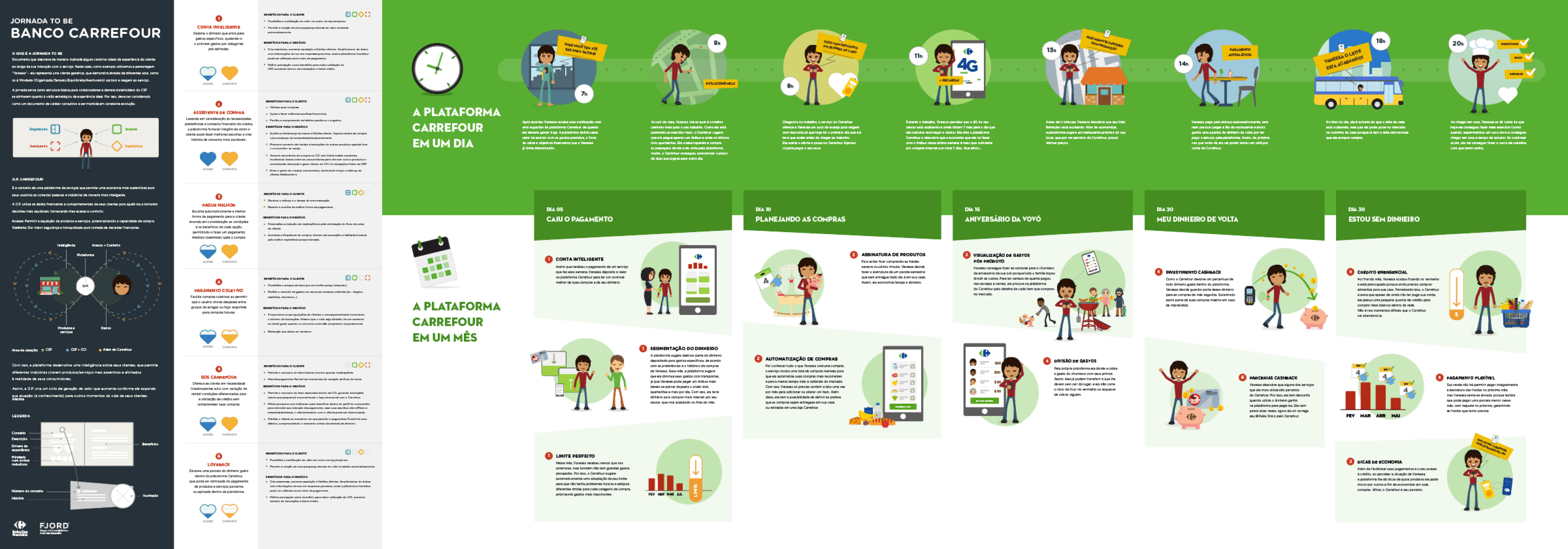
The user journey As Is have 4 big steps, each one divided into his own interactions Awareness, Acquisition, Use and administration. But to really fill the gap we realized that we should act in few steps before so introduced the Planning and Find Offers. With that in hand we could illustrate and have a clear vision of the impact we could make.

Analysis

Considering the user and business needs, after a co-creation section with stakeholders, we designed the future of Bank’s Carrefour experience based in 2 user tasks. To have an idea of potential we created tasks thinking about a daily story use and a monthly story.

That experience was based on 6 service concepts:

That experience was based on 6 service concepts:

Smart account

Smart account

Collective payment

Collective payment

Shopping assistant

Shopping assistant

Pay better

Pay better

Loveback

Loveback

SOS Carrefour

SOS Carrefour

interaction design

interaction design

user task

We defined an user task to have a path to build the functionalities, at this point we could have an idea of how to connect the service concepts in a product.

Smart account

Collective payment

Shopping assistant

Pay better

Loveback

SOS carrefour

prototypes

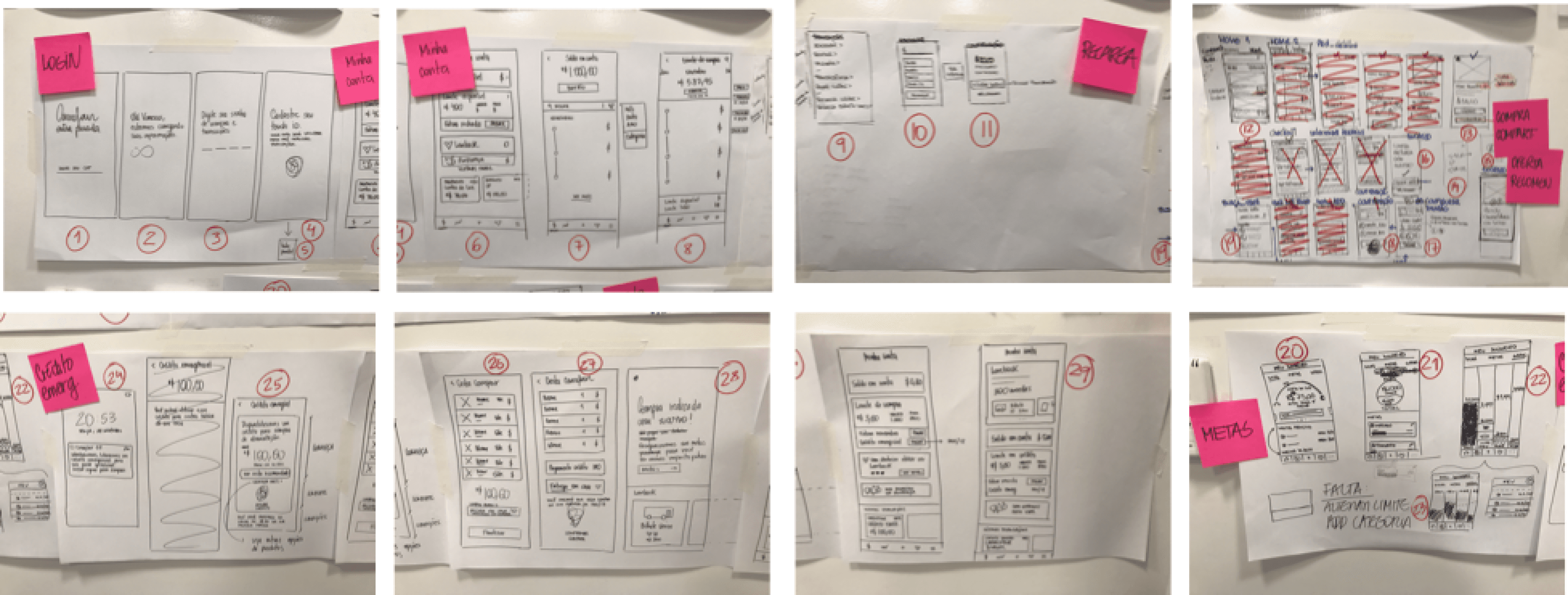
After defining the macro steps in mind we could break into more specific funcionalities and define the small interactions of the product.

Visual design

Visual design

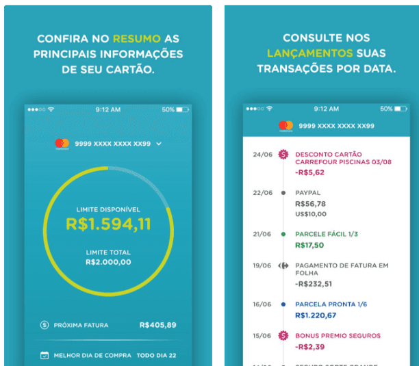
CURRENT SCENARIO

The current App work as a simple purchase history with a mix of Blue and Green colors from CFS.


CFS are not recognized by the people because every marketing action from Carrefour are based on the retail colors.


The current App work as a simple purchase history with a mix of Blue and Green colors from CFS.

CFS are not recognized by the people because every marketing action from Carrefour are based on the retail colors.


design drivers

Based on the users mindsets we focused the design in 3 pillars.

Simplicity

Visual elements and communication, making interactions easy to use and understand.

Fluid

Make interactions charming and engaging

Make interactions charming and engaging.

Focus

Help users to find the information needed when they need.

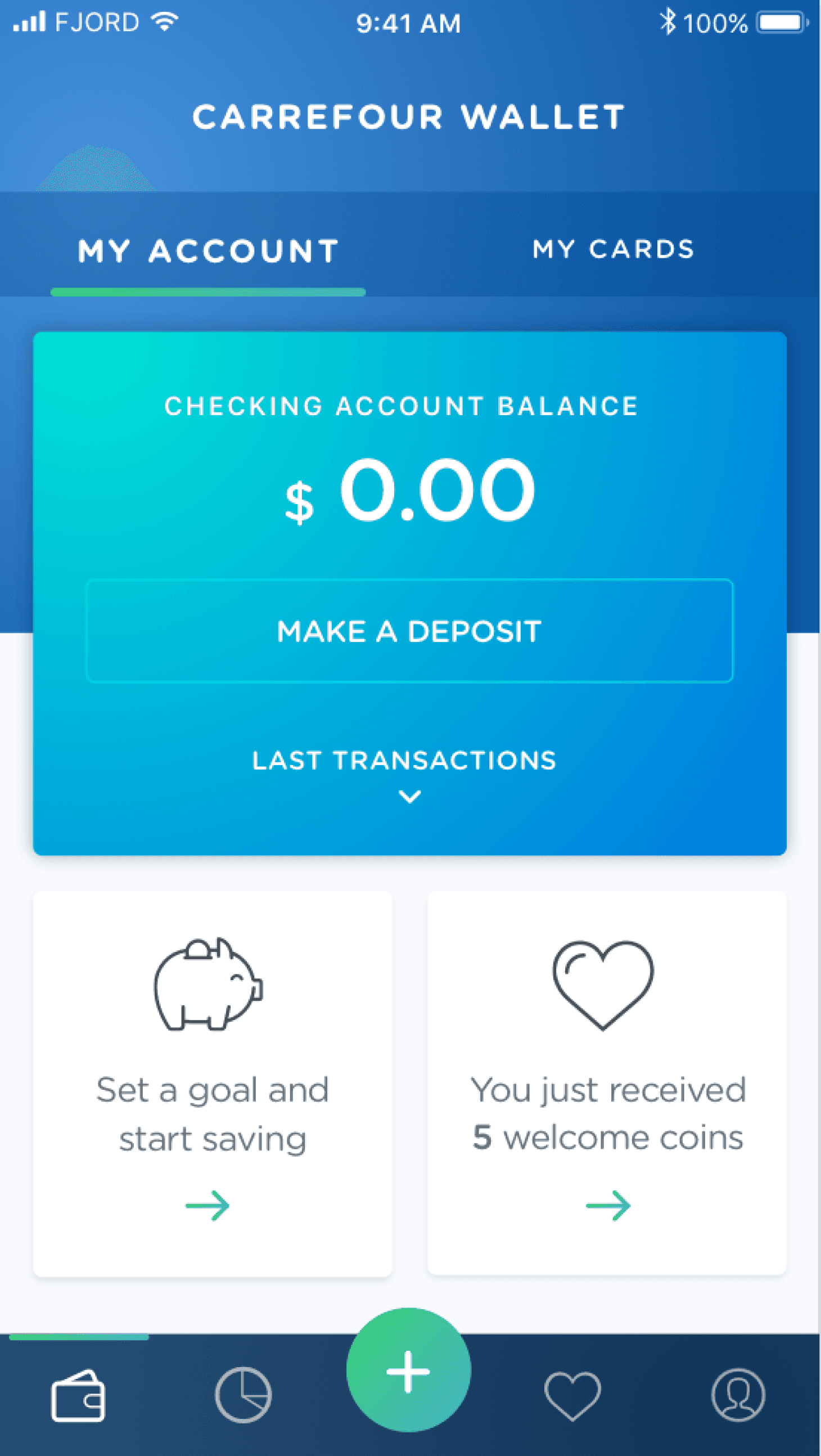
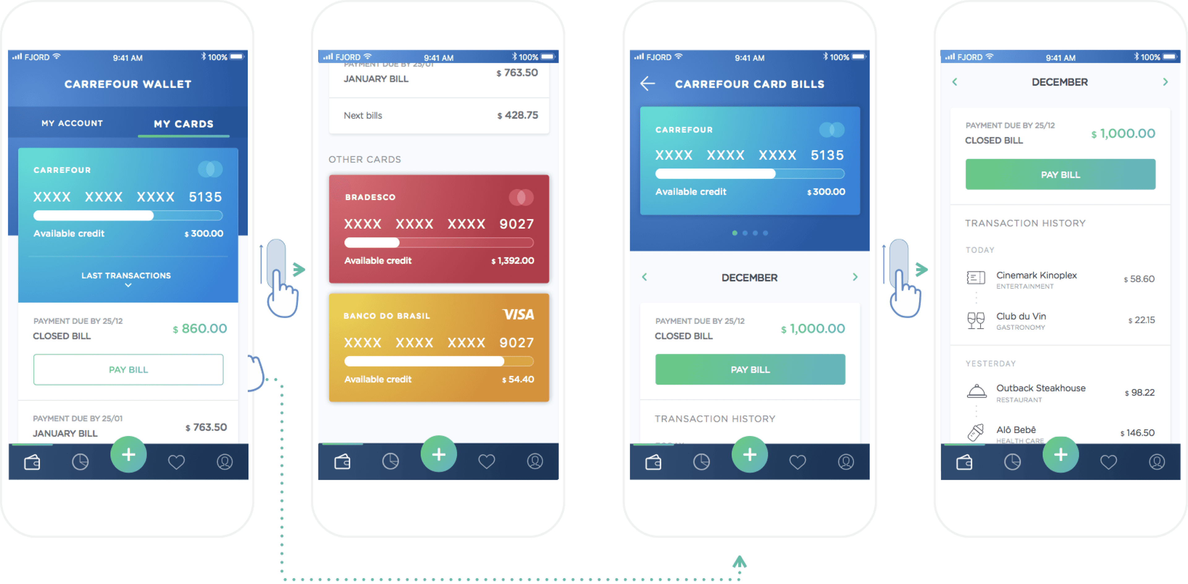
Carrefour wallet

Clients can have in a single place all the purchases, allowing to have an overview of his full financial capacity.

Clients can have in a single place all the purchases, allowing to have an overview of his full financial capacity.

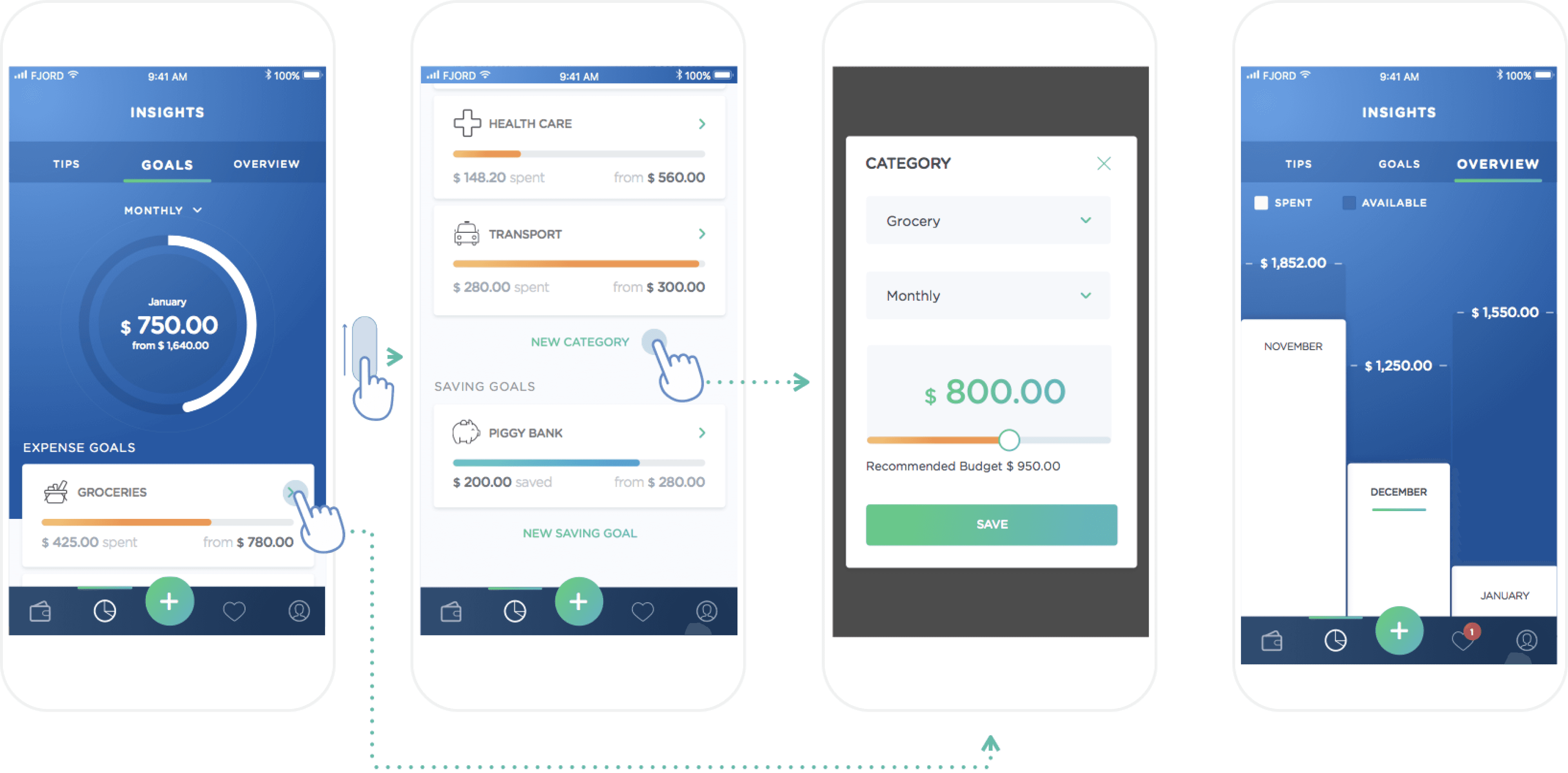
It helps to define goals and savings, giving visibility to client’s financial planning today and for the future.

It helps to define goals and savings, giving visibility to client’s financial planning today and for the future.

Possibility to make payments in a fast way by using the digital cards or QR/Barcode readers.

Possibility to make payments in a fast way by using the digital cards or QR/Barcode readers.

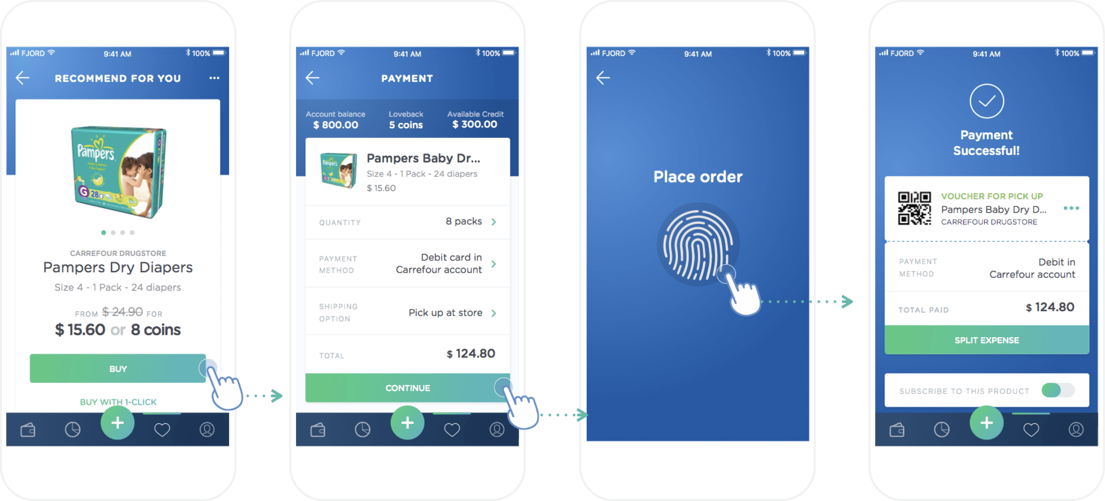
Recommendations based on consumer habits. Allows split payments and subscription.

Recommendations based on consumer habits. Allows split payments and subscription.

The app understand and walk together with the client even on emergencies, offering better options to hire loans.

The app understand and walk together with the client even on emergencies, offering better options to hire loans.

Delivering a
more relevant experience to credit card clients

Context

CSF is a financial services branch from Carrefour Market that provides access through credit card to his clients. CSF is popular between lower income group due to the easy access to credit, however, it offers an experience below the average and leads people to acquire debits. We were requested to value propostion to the Credit Card and redesign the App.

My role

  • UX Research

  • Product Design